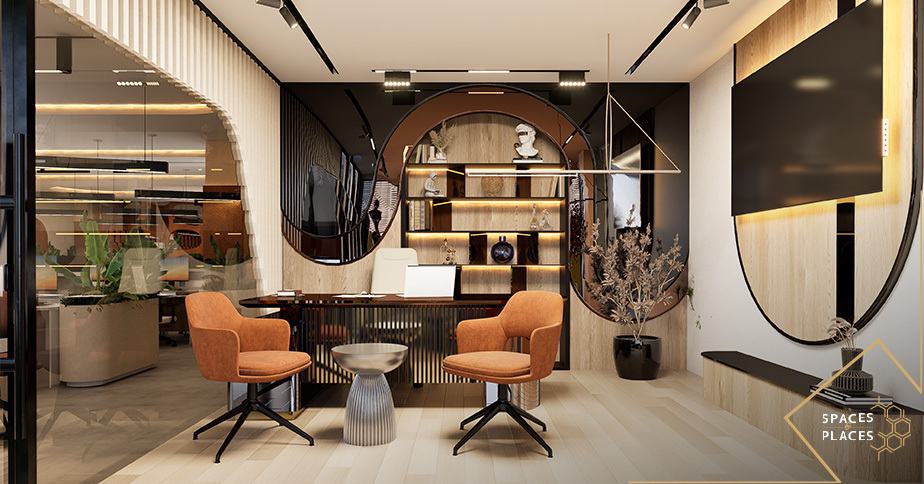

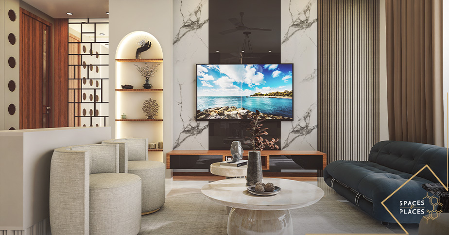
Have you ever noticed how one room instantly makes you feel calm while another feels energetic and lively?
Colour has the power to change the entire feeling of a space.
The right shade can make a room feel larger brighter warmer more peaceful or more luxurious. That is why colour psychology in interior design is not simply about choosing colours that look attractive. It is about understanding how colours work with your mood your lifestyle your furniture your lighting and the overall character of your home.
For homes in Lahore natural sunlight room size architectural style and material choices can all influence how a colour looks and feels.
So how do you choose the right colours for your home?
Let’s explore how different colours can influence the mood and personality of your home.
Why Colour Matters in Interior Design
Colour is one of the first things we notice when entering a room. It can immediately influence the atmosphere and personality of the space.
A well-planned colour palette can make your home feel:
- Calm and relaxing
- Warm and welcoming
- Fresh and spacious
- Elegant and luxurious
- Modern and sophisticated
- Energetic and lively
But colour should never be selected in isolation.
Your wall colour needs to work with your flooring furniture lighting curtains materials and architectural details.
This is where thoughtful home interior design makes a difference. Instead of selecting colours randomly every element is considered as part of one complete interior.
Understanding Colour Psychology
Different colours can create different feelings and visual impressions.
Your personal taste is always important but understanding the general psychology behind colours can help you make better decisions.
Blue Calm and Peaceful
Blue is commonly associated with calmness relaxation and tranquillity.
Soft blue shades can work beautifully in:
- Bedrooms
- Bathrooms
- Reading areas
- Relaxation spaces
For a sophisticated look combine soft blue with warm white beige natural wood or subtle metallic details.
Green Natural and Refreshing
Green brings a natural feeling into an interior.
Shades such as sage green olive and muted green can create a peaceful atmosphere while adding personality to the room.
Green works especially well with:
- Natural wood
- Stone
- Cream
- Beige
- Warm lighting
Yellow Bright and Positive
Yellow can bring warmth brightness and energy into a room.
However strong yellow does not always need to cover an entire wall. Softer yellow shades or small accents can create a cheerful atmosphere without overwhelming the space.
Try yellow through artwork cushions decorative accessories or selected furniture pieces.
Terracotta — Warm and Inviting
Terracotta rust clay and earthy shades can make a home feel warm and grounded.
These colours can work particularly well in living rooms dining areas and social spaces.
Pair them with neutral walls natural wood and textured fabrics for a comfortable and sophisticated result.
Grey Modern and Sophisticated
Grey is a versatile colour for contemporary interiors.
Soft grey can create a clean understated look while charcoal can introduce contrast and drama.
Grey can be paired with:
- White
- Black
- Walnut
- Natural stone
- Brass
- Gold accents
The right undertone is important because some grey shades can feel cool while others create a warmer atmosphere.
The Timeless Appeal of Neutral Colours
Neutral colours continue to be popular in modern interior design in Lahore because they provide flexibility and timeless appeal.
Popular neutral shades include:
Warm white • Cream • Beige • Taupe • Greige • Soft grey
Neutral colours create a beautiful foundation for furniture artwork lighting and decorative details.
For a luxury home you can combine neutral shades with:
- Natural stone
- Wooden furniture
- Textured fabrics
- Statement lighting
- Brass details
- Soft metallic accents
The result can feel elegant without looking excessive.
Warm Colours vs Cool Colours
Understanding warm and cool colours can help you create better balance inside your home.
Warm Colours
Warm colours include:
- Red
- Orange
- Yellow
- Terracotta
- Warm beige
They generally create a feeling of:
Warmth • Comfort • Energy • Connection
They can work especially well in living rooms dining spaces and areas where family and guests spend time together.
Cool Colours
Cool colours include:
- Blue
- Green
- Purple
- Cool grey
They can create a feeling of:
Calmness • Freshness • Relaxation • Serenity
These shades can work beautifully in bedrooms bathrooms studies and peaceful spaces.
You can also combine warm and cool shades.
For example a cool grey room can be warmed up with wooden furniture warm lighting and beige textiles.
Choosing Colours for Different Rooms
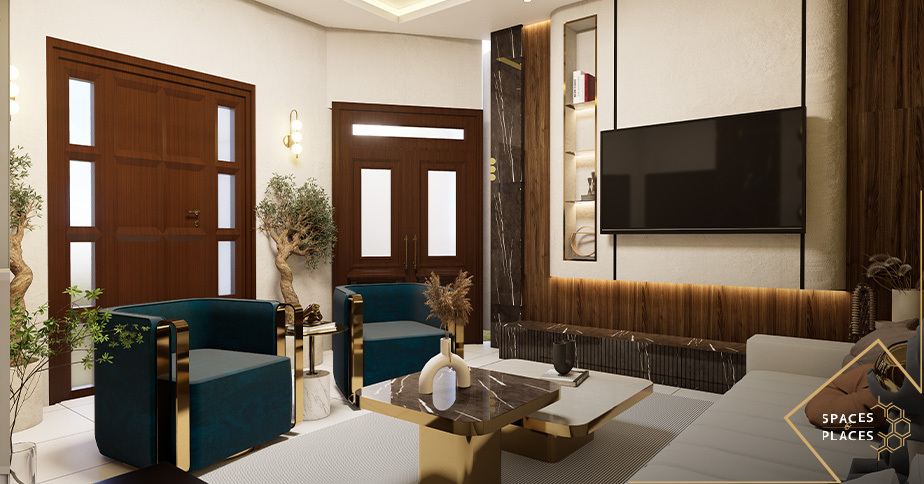
Every room has a different purpose.
The colour palette should support the way you want to feel and use that particular space.
Living Room Colour Ideas for Lahore Homes
The living room should feel welcoming while reflecting your personality.
For a modern living room consider:
- Warm beige
- Greige
- Cream
- Soft grey
- Taupe
- Olive
- Deep charcoal as an accent
If your walls are neutral you can introduce stronger colours through sofas cushions rugs artwork and decorative pieces.
A simple designer rule: choose one dominant colour one supporting neutral and one accent colour.
This keeps the room interesting without making it visually busy.
Bedroom Colour Ideas for Lahore Homes
A bedroom should feel peaceful comfortable and relaxing.
Soft colours such as:
- Warm white
- Beige
- Sage green
- Dusty blue
- Soft taupe
- Muted earthy tones
can create a calming environment.
For a more luxurious bedroom combine your colour palette with soft fabrics layered lighting wooden finishes and subtle metallic details.
Modern Kitchen Colour Combinations
The kitchen is both a functional and social area of the home.
Some beautiful combinations include:
White + Natural Wood
Clean warm and timeless.
Beige + Walnut
Elegant warm and sophisticated.
Grey + White
Modern clean and minimal.
Olive + Cream
Natural fresh and contemporary.
Charcoal + Warm Wood
Bold dramatic and luxurious.
Remember that kitchen colours should complement the cabinets countertops backsplash flooring and lighting.
Bathroom Colour Ideas
Bathrooms can benefit from colours that create a clean and relaxing atmosphere.
Consider:
- White
- Light grey
- Warm beige
- Soft blue
- Pale green
Natural stone textured tiles warm lighting and simple fixtures can make these colours feel even more refined.
How Natural Light Affects Interior Colour
Natural light can completely change how a colour appears.
The same paint shade may look different depending on the amount direction and intensity of sunlight entering the room.
Colours for Rooms With Limited Natural Light
Rooms with less sunlight can benefit from:
- Warm white
- Cream
- Light beige
- Soft greige
These shades can help the room feel brighter and more open.
Colours for Bright and Sunny Rooms
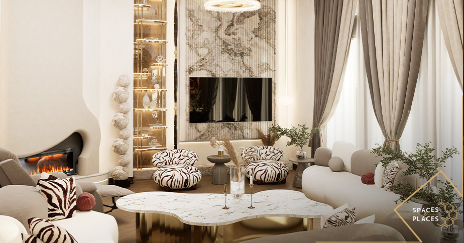
Rooms with plenty of natural light can handle deeper and richer colours more comfortably.
However the surrounding furniture flooring and lighting should still be considered.
Always test colour samples inside the actual room before making your final decision.
A colour that looks perfect on a screen may look completely different under your home’s lighting.
Best Colour Ideas for Small Homes
Colour can influence how spacious a room appears.
For smaller homes a lighter and more consistent palette can create better visual continuity.
Try:
Warm White + Beige + Light Wood
or
Cream + Greige + Natural Textures
Using related colours across connected spaces can prevent the home from feeling visually divided.
Colour works even better when combined with effective space planning services in Lahore because both colour and layout contribute to the way a small home is experienced.
How to Create a Luxury Colour Palette
Luxury does not always mean using dark colours.
In many sophisticated interiors luxury comes from balance proportion contrast texture and material quality.
Modern Kitchen Colour Combinations
The kitchen is both a functional and social area of the home.
Some beautiful combinations include:
White + Natural Wood
Clean warm and timeless.
Beige + Walnut
Elegant warm and sophisticated.
Grey + White
Modern clean and minimal.
Olive + Cream
Natural fresh and contemporary.
Charcoal + Warm Wood
Bold dramatic and luxurious.
Remember that kitchen colours should complement the cabinets countertops backsplash flooring and lighting.
Bathroom Colour Ideas
Bathrooms can benefit from colours that create a clean and relaxing atmosphere.
Consider:
- White
- Light grey
- Warm beige
- Soft blue
- Pale green
Natural stone textured tiles warm lighting and simple fixtures can make these colours feel even more refined.
How Natural Light Affects Interior Colour
Natural light can completely change how a colour appears.
The same paint shade may look different depending on the amount direction and intensity of sunlight entering the room.
Colours for Rooms With Limited Natural Light
Rooms with less sunlight can benefit from:
- Warm white
- Cream
- Light beige
- Soft greige
These shades can help the room feel brighter and more open.
Colours for Bright and Sunny Rooms
Rooms with plenty of natural light can handle deeper and richer colours more comfortably.
However the surrounding furniture flooring and lighting should still be considered.
Always test colour samples inside the actual room before making your final decision.
A colour that looks perfect on a screen may look completely different under your home’s lighting.
Best Colour Ideas for Small Homes
Colour can influence how spacious a room appears.
For smaller homes a lighter and more consistent palette can create better visual continuity.
Try:
Warm White + Beige + Light Wood
or
Cream + Greige + Natural Textures
Using related colours across connected spaces can prevent the home from feeling visually divided.
Colour works even better when combined with effective space planning services in Lahore because both colour and layout contribute to the way a small home is experienced.
How to Create a Luxury Colour Palette
Luxury does not always mean using dark colours.
In many sophisticated interiors luxury comes from balance proportion contrast texture and material quality.
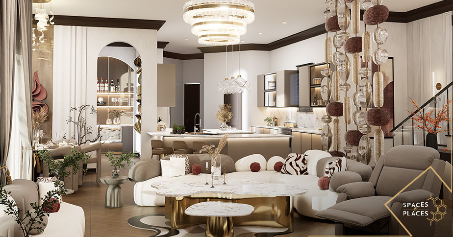
Warm White + Beige + Walnut + Brass
A warm and elegant combination for sophisticated residential interiors.
Greige + Charcoal + Wood + Gold
A contemporary palette with depth and contrast.
Cream + Olive + Natural Stone + Bronze
An earthy combination that feels calm refined and timeless.
The secret is not using more colours.
The secret is using the right colours together.
How to Use Accent Colours
You do not need to paint an entire room in a bold colour to make an impact.
Accent colours can be introduced through:
- Feature walls
- Sofas
- Cushions
- Curtains
- Rugs
- Artwork
- Decorative accessories
- Statement furniture
For example a neutral living room can become much more interesting with deep green navy terracotta or charcoal accents.
This also gives you flexibility because accent pieces can be changed more easily when you want to refresh your interior.
5 Things to Consider Before Choosing a Colour
Before finalizing your home’s colour palette consider these five important factors.:
1. Natural Light
Look at how sunlight enters the room throughout the day.
2. Room Size
Lighter colours can help smaller rooms feel more open while deeper colours can add character to larger spaces.
3. Furniture and Materials
Your wall colours should complement your flooring furniture cabinetry curtains and other finishes.
4. Function of the Room
A bedroom may require a calmer atmosphere while a living room can accommodate stronger accent colours.
5. Overall Home Palette
Different rooms can have their own character while still feeling connected through complementary colours and materials.
Common Colour Mistakes to Avoid
Even a beautiful colour can look wrong when it is used without considering the rest of the interior.
Avoid these common mistakes:
- Choosing colours without considering natural light
- Using too many contrasting shades
- Selecting colours only from online images
- Ignoring furniture and flooring
- Using strong colours across too many surfaces
- Following trends without considering long-term appeal
- Making every room completely different
The goal should be balance and harmony rather than simply adding more colour.
Colour Trends vs Timeless Interior Design
Interior trends change but your home’s main colour palette should ideally remain appealing for years.
A timeless approach is:
Neutral Foundation + Natural Materials + Carefully Selected Accent Colours
This gives you the freedom to update your home through artwork cushions curtains rugs and accessories without completely redesigning the space.
Trendy colours can still be introduced but they are often better used as accents rather than the foundation of the entire home.
How an Interior Designer Can Help With Colour Selection
Choosing colours becomes much easier when the entire interior is considered as one composition.
An experienced interior designer in Lahore can consider:
- Natural and artificial lighting
- Room proportions
- Furniture
- Flooring
- Ceiling
- Materials
- Architectural style
- Lifestyle
- Personal preferences
- Visual connection between rooms
At Spaces and Places colour selection can be integrated with complete residential interior design so that colours furniture lighting materials and spatial planning work together.
You can also explore our Residential Interior Design services for a complete approach to designing your home.
Frequently Asked Questions About Colour Psychology in Interior Design.
Which colour is best for a peaceful bedroom?
Soft blue sage green warm beige cream and muted earthy shades can create a calm and relaxing bedroom atmosphere.
What colours make a small room look bigger?
Light shades such as warm white cream light beige and soft greige can help a small room feel brighter and more spacious.
What colours are best for a luxury home?
Warm white beige greige taupe and soft grey can create an elegant foundation when combined with quality materials natural wood stone and subtle metallic accents.
H3: How does natural light affect interior colours?
Natural light can change how a colour appears. The same shade can look warmer cooler brighter or darker depending on the amount and direction of sunlight entering the room.
Should every room in a home have the same colour?
Not necessarily. Different rooms can use different shades while maintaining a connected overall palette through complementary colours materials and finishes.
How can an interior designer help with colour selection?
An interior designer can consider lighting room size furniture flooring materials architectural style and the purpose of each space before developing a suitable colour palette.
Final Thoughts
The right colour can completely transform the way your home looks and feels.
Whether you prefer warm neutrals calming greens elegant greys timeless whites or rich accent colours the best palette is one that works with your architecture lighting furniture materials and lifestyle.
For homes in Lahore thoughtful colour selection can turn an ordinary interior into a space that feels personal balanced comfortable and beautifully designed.
At Spaces and Places we believe great interiors are created when every detail works together.
The right colour does not simply decorate your home. It helps define how your home feels.
If you are planning a new home or renovating an existing property explore our Interior Design Services in Lahore and let your space tell your story.